DeltaBlade 2700 Re:Create
“DeltaBlade 2700 Re:Create is an action-packed 2D competitive local multiplayer cyberpunk-themed platformer with fast-paced robot ninja sword combat and jetpacks, focusing on gameplay variety and user-created content.”
| DeltaBlade 2700 | DeltaBlade 2700 Re:Create |
|---|---|
| The original DeltaBlade 2700 was created in C Processing by team Handshake Firm during their first year at the DigiPen Institute of Technology. The team consisted of 5 programmers in the beginning and brought on additional members during the Summer to polish the game and release on Steam, free to play. It was even featured at Pax West 2019! | For our fourth year at DigiPen, we decided to re-form Handshake Firm with some new members, bringing the team size to 11. We all had a love of DeltaBlade 2700 and we wanted to expand our programming skills and have a chance to experiment. So we decided to recreate DeltaBlade in an entirely custom engine of our own making. |
DeltaBlade 2700 Re:Create is powered by a custom engine written in C++ and rendered with Vulkan. The engine is built with CMake and the project was maintained with GitLab. The game runs on Windows, Mac, and Linux, and the Nintendo Switch.
As part of the original plan for the project, we wanted to release the game on the Nintendo Switch. In order to accomplish this we had members of the team including myself take the Intro to Portable Game System class at DigiPen. This class taught us how to work with Nintendo Switch development kits and we were given the green light to attempt to port our game to the Nintendo Switch hardware for the class’s final project. Thanks to our forward thinking in how we built the project during the first half of the semester, we succeeded in porting the game and even added in additional features that took advantage of the hardware!
Unfortunately, due to circumstances beyond our control, while we were encouraged to continue development on the hardware, we would not be able to publish the game for the hardware. Given this news, we decided to discontinue development on the Switch so that team members could focus on other opportunities for the next semester. Some members including myself decided to continue working on the PC build of the game so that we could enhance the game with new features and gameplay.
Overview
A quick rundown of some of the work I accomplished on DeltaBlade 2700 Re:Create.
Performance Profiler
I integrated 2 performance profilers into our engine under a common API. Optick was integrated for profiling on Windows machines, while the profiler from the Nintendo SDK was integrated for the Nintendo Switch version of the game.
UI System
I created the UI system for our engine which would be used to create all of the game’s menu screens as well as the new Level Editor. The UI system is integrated with the rest of the gameplay systems as ECS components. Continue reading to the “UI System” section for more details.
Level Editor
One of the new additions to DeltaBlade 2700 Re:Create is the in-game level editor accessible from the main menu. I created this editor to be controller friendly and to allow players to create levels quickly and test them with the new game modes that have been added.
UI System
Designing for parity
For our project we didn’t need anything particularly comprehensive for our custom engine’s UI system. The primary goal was to create a system that would allow us to re-create the UI scenes from the original game, but I had a secondary goal in mind as well. I started this project with a dream of adding a new level editor to the game and I had a particular user interface in mind for this editor. I decided that if I wanted to eventually create this level editor how I imagined, the best course of action would be to design a UI system that accomplished both of these goals at the same time.
I started the process of designing this UI system by going back to the original game and drawing out how each UI scene operated. I wanted to build an understanding of all the different input and behaviors each scene needed.
Main Menu
The main menu has a simple vertical list of “Selectables” (buttons) that can be hovered/unhovered/selected. The input we are concerned about:
- Navigate Up/Down
- Select
Options
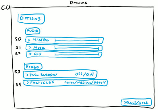
The options menu has a vertical list of “Selectables.” The user can navigate up/down this list. When we are hovering over some of these selectables, we can execute some sort of functionality with right/left input. E.g. We can press left/right on the d-pad to move the ‘Master’ volume slider. The input we are concerned about:
- Navigate Up/Down
- Execute on Left/Right
- Select*
* Select in this scene is optional and may perform the same functionality that the ‘Right’ input would do.
How to Play
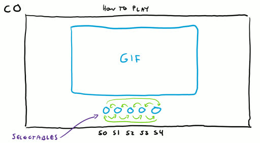
The how to play scene is our first example scene where we have a horizontal list of “Selectables” that we need to navigate through with left/right. In this particular scene ‘Select’ doesn’t do anything, we are simply flipping through pages of how-to-play gifs. The input we are concerned about:
- Navigate Left/Right
Exit Confirmation
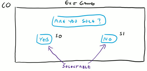
The exit confirmation screen has a simple horizontal list of 2 “Selectables.” Again, we need to be able to navigate left/right between these buttons, and be able to select them. The input we are concerned about:
- Navigate Left/Right
- Select
Pause
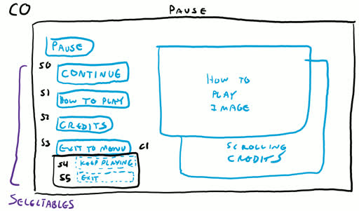
The pause screen is our first example of a relatively complicated UI setup. There is a vertical list of 4 “Selectables” visible when the screen first comes up (S0 - S3). We can navigate up/down between these buttons and select them. The remaining selectables (S4, S5) are hidden until the ‘Exit to Menu’ button is pressed. At this point we can ONLY navigate up/down between these 2 buttons. If we select ‘Keep Playing’ however, we go back to navigating the first 4 buttons, meanwhile S4 & S5 are made hidden again.
The input we are concerned about:
- Navigate Up/Down
- Select
Putting it together
Once the UI screens we needed to recreate had been analyzed, I could sum up the features the UI system needs to support so far:
- Navigate Up/Down
- Navigate Left/Right
- Execute on Left/Right
- Select
In addition to input, the UI system needed to support certain behaviors:
- The options screen made evident that in certain cirumstances we wanted to be able to choose between navigating Left/Right and executing on Left/Right. Executing meaning that we call some sort of function for example
- The pause screen shows that selectables need to be able to be “grouped” together in some way
- When we enter/exit these groups, we want to have the option of executing some sort of functionality. E.g. hiding/showing certain buttons.
This was a good start; now it was time to take a look at what I needed from my future level editor.
Designing for the future
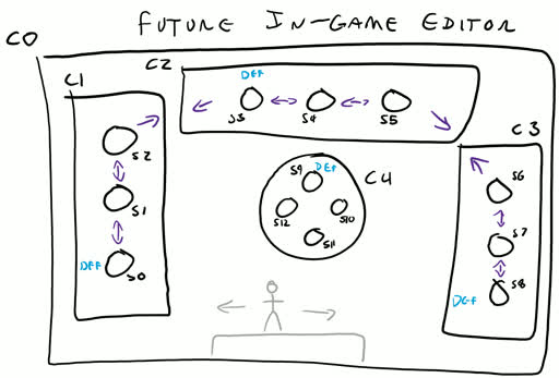
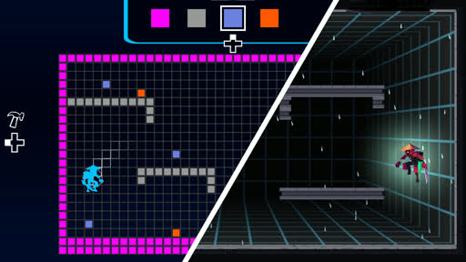
(Left) A screenshot of a sample DeltaBlade level I made in Mario Maker when I was toying with the idea of what I wanted my level editor to do and look like. (Right) A rough drawing i made showing the general layout of what my future level editor might look like.The editor interface I wanted to design for DeltaBlade 2700 Re:Create was inspired by the interface in Super Mario Maker 2. I didn’t know the specifics of how it would look yet, but I knew what behaviors I wanted to support.
At this point the details of how our UI system would work were starting to form in my head. Now is a good time to start explaining some of the labeling that has been showing up in my drawings. I mentioned in the Overview section that the UI system was comprised of 2 ECS components: UISelectable and UIContext. Objects in my drawings marked with (S#) indicate that those objects are UISelectables or “Selectables.” Regions marked with (C#) refer to UIContexts or “Contexts.” As a high level overview of what selectables and contexts are:
- Selectables: These are objects such as buttons. They can be navigated to, unhovered, hovered, and selected. Relationships can be defined between selectables so that you can navigate from one selectable to another.
- Contexts: These are objects that in a way group together selectables. Certain behavior can be executed when we jump around between selectables in different contexts.
In Super Mario Maker you usually move around a cursor in the center of the screen to manipulate blocks on the grid. The UI elements are grouped together on the left, top, and right sides of the screen. The user can seamlessly navigate from one grouping of buttons to another.
I wanted my level editor to share the same sort of layout. On the left side I would have some group of buttons under C1 for changing how we interact with the level. The top of the screen would have some group of buttons under C2 that represented different tiles that could be picked and placed in the level. The right side of the screen would have some other group of buttons under C3 used to interact with the level. I also played with the idea of having some sort of central menu that would pop-up under C4.
With all of these evaluations in mind, I was confident that there weren’t any more inputs or behaviors that our UI system needed in order to support our game UI and level editor goals. I had my plan in hand and got to work building the game UI in the first semester, and the level editor in the second semeseter.
Level Editor
Years Later…
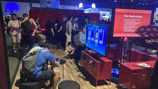
I’m very proud of our team for the work we put into this game. It never gets old when I hear that the game is playable at the DigiPen booth at Pax West another year.
Pax West 2024More Projects⮕

